This article may contain affiliate links. If you buy some products using those links, I may receive monetary benefits. See affiliate disclosure here
Have you ever come across blogs with awesome content, but difficult to read?
Blogging is not only about researching a topic and crafting the words, but the presentation is also equally important.
Editing a blog article is not done with spelling and grammar correction. You should take time to properly format it as well.
A well-formatted blog post gives a great user experience to the user, thereby making a positive impression about your brand on their mind.
Let's discuss some of the tips I use to format my blog posts.
1. Use Appropriate Subheadings
Books have chapters. Likewise, your blog posts should also have divisions.
Identify the main points that you are going to cover in that article. Then create a section for each of those points, starting with a heading. You can also create subheadings to cover sub-points.
For instance, if you are writing a review about a product, then you can create headings like Features, Advantages, Disadvantages, How to use, etc. The idea is to group the related points together.
- While crafting the heading text, make sure it clearly specifies the idea.
For instance, for this section, I give the heading as "use appropriate subheadings" instead of just mentioning it vaguely as "subheadings". Now you know what to expect in that section.
Use the HTML H2 tag for the top-level heading (the main post title will be H1). For sub-points inside a section, use tags like H3, H4, etc.
Each heading level should be visually distinct from one another. Make it easier for the reader to distinguish between a heading, subheading, and sub subheading.
The main post title should be the largest, followed by H2, H3, H4, etc. If you are using a good theme, then it is automatically taken care of. Or, you can use the customizer to set proper font sizes.
2. Split Long Paragraphs
Long paragraphs with hundreds of words are difficult for anyone to read. Such paragraphs appear to the reader as large blocks of unparseable text. It can easily kill their interest forcing them to bounce off.
So what you have to do is, identify the places where you can split the long paragraphs. Ideally, a single paragraph should convey a single idea. Then you can enrich it with 3 or supporting sentences.
It's recommended to keep the paragraph length under hundred words to ensure maximum readability.
There are no strict rules on how you should do it. But the paragraphs should be cohesive. The ideas should flow smoothly from one to the next. Make ample use of transition words to maintain continuity.
3. Emphasize Text Wherever Necessary
A simple but effective way to make the text more readable.
Bolding the key phrases and highlighting important sentences can make it easy for the user to skim the content.
Not only bold, but you can also try variations like italics, underline, highlights, etc. These enhancements are like salt in food. So don't add it too much. One or two such variations for every 500 words can be sufficient.
4. Insert Diverse Elements
Don't forget that a blog post is also a web page. So there is no rule that you should use only headings and paragraphs.
Leverage the power of your text editor to come up with visually appealing designs. Insert icon lists to list out the important points, infoboxes to highlight important sections, blockquote, tweet boxes, tables, etc to name a few.
Adding diverse elements can greatly improve the readability of your blog posts, especially for long-form content. The Backlinko blog is a great example where you can see the wise use of elements.
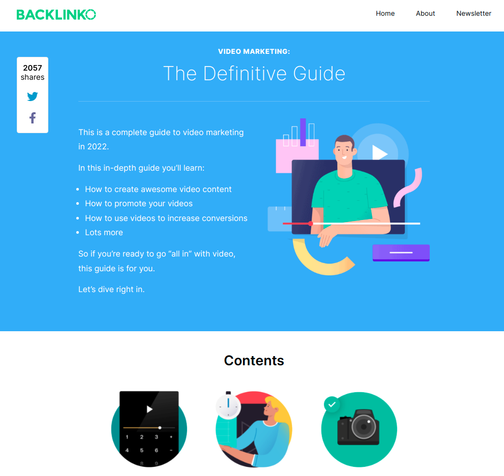
Using diverse elements in blog posts: a screenshot of Backlinko blog
If you are using WordPress, then you can spice it up with the help of plugins like Stackable. You can experiment with multi-column layouts, sections with backgrounds, etc.
Sensibly using such diverse elements can improve the user experience, thereby improving the visitor duration. However, remember not to overdo it.
5. Proper White Space
Adding proper white space is an art and a science. Lack of it can fatigue the user while too much of it can make the design look bland.
The following are the things that you should look out for:
- line-height
- spacing between paragraphs
- padding around elements
- spacing between columns
- margins
Well-designed themes usually do a good job of setting these properties properly.
6. Set Blog Layout for Maximum Readability
Responsive design is a must these days. Most themes are responsive so that users can read the text on any device - mobile, tablet, or desktop - without scrolling horizontally or zooming in.
Also, note that there are several layout structures you can use:
- Narrow width
- Wide width
- Right sidebar
- Left sidebar
- No sidebar
What style is right for you depends on the context of your blog. For instance, if you want to ensure maximum readability, then a no-sidebar layout may be the best. That's what sites like medium.com do.
However, there is no issue in using a sidebar if your site demands that. But try not to clutter the sidebar area with too many widgets that distract the reader.
Another thing that you should never overlook is the maximum content width. According to many sources, the optimal line length is around 80 characters.
Never allow your text to run from the very left of the screen to the very right when viewed on widescreen monitors. On this blog, I have set the maximum content width to 720 pixels, which ensures that it is not too wide or too narrow.
7. Don't ignore typography
Typography is at the heart of web design. It can make or break your content. In fact, this point should have been at the top of this list.
Firstly, you need to pick a good font family. Google Fonts is a great place to find hundreds of free web fonts.
- If you have no idea which font family is right for your website, then I recommend you to pick one of the popular serifs or sans serifs typefaces. Usually, sans-serif works best for body text.
Also, check out this post about the best font pairs that work well together. It's better to stay away from fancy typefaces like handwriting and display fonts.
Secondly, you need to set the right font size. Usually, 16 to 18 pixels work best for the body text.
8. Add Table of Contents
A table of contents can be highly useful for long-form content. It helps the user to get an overview of what is included in the post. Just before the first heading is usually the best place to add the table of contents.
One way is to manually list all the main headings and link to the anchor elements while composing the post. But it can become quite difficult to manage if you have tens or hundreds of posts.
So a better way is to use a plugin, depending on your content management system. WordPress has several plugins that can automatically generate a table of contents by parsing your post body.
Most plugins allow you to choose the heading levels that should show up in the table of contents. If you have multiple heading levels then there is no need to show all of them like on Wikipedia. The main headings and subheadings are sufficient. Otherwise, you will end up having a very long list.
9. Links & Buttons
Hyperlinks are another type of element that can grab the reader's attention. Links inserted between the text has several other benefits as well:
- It adds more depth to the information
- Helps to improve the SEO
There are mainly two types of hyperlinks that you can insert within a post: internal links and external links.
Internal links point to other related posts on the same website while external links point to relevant sources on other websites.
You should use both of them. However, there is no need to add links in each sentence. One or two links per 500 words are sufficient.
Make sure you use a different color for the hyperlink so that they stand out.
If you want the user to take some action rather than just pointing them to another web page, that's when you use buttons.
For instance, you can use buttons for call-to-actions like Add to Cart, affiliate links, etc.
So, if you want the user to do something after reading the blog post, then it is better to use a button rather than just a normal hyperlink.
10. Add Images
Images in blog posts are not just for aesthetic purposes. It helps the reader to grasp complex ideas faster.
You should use screenshots, photographs, infographics, diagrams, etc wherever required.
Also, don't forget to add proper alt text for all the images so that search engines can easily understand what your images mean. You can also add image captions to make it easy for the reader.
11. Add Rich Media
There is no need to limit your content to text and images alone. These days many websites embed videos within blog posts.
Some ideas are better conveyed with a video rather than just written content. Tutorials and instructions are examples where videos can work well.
Another thing that you can try is to add an audio version of your blog post. Some users may like to hear it than to read it.
12. Add Related Posts
There is another brilliant way to retain the readers even after they have finished reading a blog post - add a related post section at the end.
There are several WordPress plugins that automatically curate a list of related posts based on the tags and categories you have assigned to the current post.
An even better way is to manually pick the articles. It may require some manual work but it is well worth it.
You can show the related articles in a separate section below the conclusion. Or you can make it look even better by showing the featured image As I have done below.
In another post, I will show you how I did it with the help of the Metabox plugin and some custom code.
Conclusion
So, we have discussed the top tips to format a blog post for better readability. Have some thoughts? Share it below.