This article may contain affiliate links. If you buy some products using those links, I may receive monetary benefits. See affiliate disclosure here
Just like the colors, setting the right typography is also an essential part of designing a website. Even if it is a simple blog, having an appropriate set of fonts helps to make a positive feel on your reader's mind.
A study shows that people connect certain fonts with certain emotions. You can read more about it in an article published in Hubspot. So, fonts are not just for aesthetic purposes. It can influence the way readers receive your content.
Although there is nothing wrong with using only one font, a pair helps to add a bit of diversity. So, choosing two companion fonts - one for headings and the other for content - is usually the best approach.
So, the two types we discuss here are:
- Display Face - for bigger texts like headings
- Text Face - for chunks of text like paragraphs
See also:
Why not pair any two fonts together?
Every website has a purpose and a mood it wants to convey to the audience. If you can choose fonts that conform to those values, you cannot go wrong. In short, the fonts you choose should not conflict with each other.
However, there are no definite rules in finding the best font pair. Instead, use your artistic mind to make sure they don't conflict with each other.
In the list below, you can find a couple of such pairs of fonts that work well together. Google Fonts have one of the best collections of typefaces available for any project. So, I have only used fonts from that library.
You might also like:
Things to look when combining fonts
Whichever niche your website belongs to, there are a couple of things you should always keep in mind while selecting fonts.
- Readability: You cannot know at what zoom level a reader is using. So, make sure that the text is readable, even at small sizes. For headings, you can give more emphasis to the beauty aspect. But for paragraphs with big chunks of text, readability comes first.
- Produce the desired feel: As mentioned above, both the fonts should help to evoke the desired emotion in the audience. It even influences the decisions a user makes while on the site.
- Enough Differences: While the two fonts should not conflict, they should still have enough differences to distinguish each other. Otherwise, if they are too similar, there is no point in using two fonts.
That's the main reason why pairing a serif font with a sans-serif works best.
In addition to these critical things, take attention to the different characteristics like letter shapes, thickness, height, and width as well.
With that, let us look at the pairs.
On this blog, I use the Astra Pro theme, which allows integrating any Google font right from the WordPress admin. If you are a WordPress user, you should check out Astra (read review).
Best Google Font Combinations for Websites
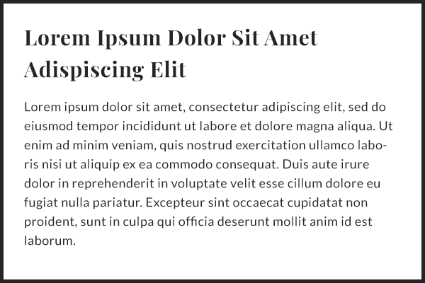
1. Lora & Lato
Lato is a neat text-face that feels warm and friendly. Together with Lora, a serif font, the combination looks elegant and highly readable.
It can work great on magazine-style websites, depending on the niche.
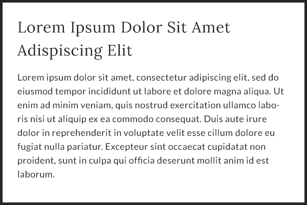
Lora & Lato (Regular weights)
In addition to suitable typography, good graphics is another factor that makes a website effective. On this website, I mostly use Canva, a free tool to create graphics for websites, and social media posts.
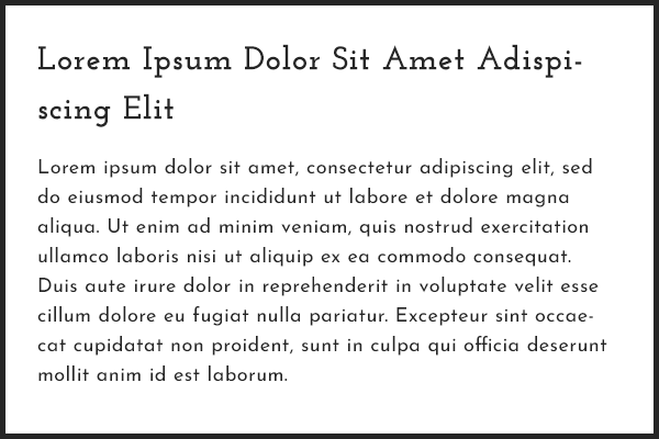
2. Merriweather & Open Sans
If you want a well-balanced font with excellent readability over different screen sizes, then Open Sans may be the best choice.
Along with Merriweather as the display face, you have a stable combo in hand.
However, the neutral feel of Open Sans may not be perfect for all websites.
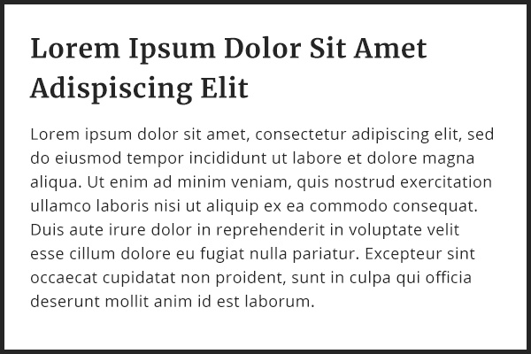
Merriweather bold & Open Sans Regular
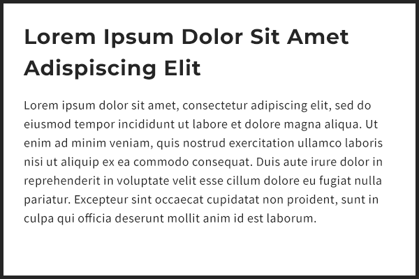
3. Roboto Slab & Roboto
As both are relatives, Roboto and Roboto Slab work well on many projects like technology and marketing sites.
Although the letters are geometric, the rounded and balanced strokes create a friendly feeling.
Currently, Roboto is the most popular family on Google Fonts.
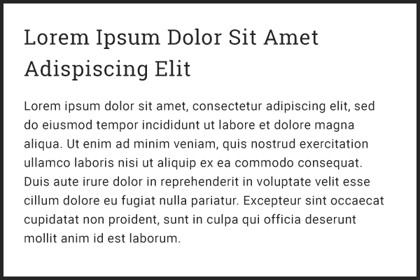
Roboto Slab & Roboto (Regular weights)
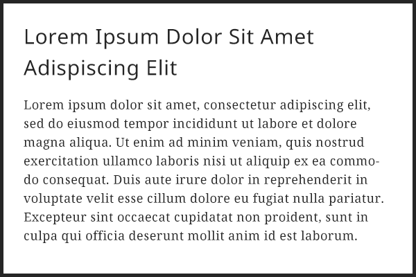
4. Fira Sans & Merriweather
Unlike Open Sans or Roboto, Merriweather is a serif font. With its large x-height, there is no compromise on readability. So you can use it confidently for the body copy.
Fira Sans is a sans-serif face that can do well for headings along with Merriweather for the text. You can also use Merriweather Sans instead if you want more similarity between the pair.
The pair looks well for literature and other works where you need a bit of a traditional feel.
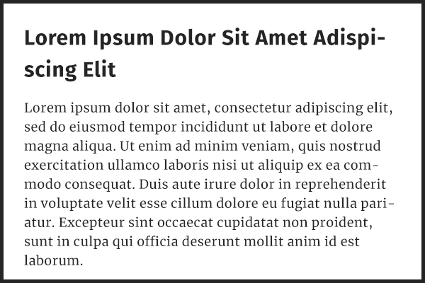
Fira Sans bold & Merriweather Regular
5. Playfair Display & Lato
Look at the thin and thick letter strokes along with the rounded and upright stance of Playfair Display. Those features give it a modern and luxurious appearance.
Paired with Lato, it can work well for websites related to fashion, resorts, interior design, etc.
Since Playfair Display's letters have high contrast, it is better to use it for headings only.
Playfair Display bold & Lato Regular
6. Josefin Slab & Josefin Sans
Josefin Sans' creator, Santiago Orozco designed this typeface to produce a vintage feeling.
Josefin Slab is its serif companion with relatively thin letters.
Josefin Slab & Josefin Sans (Regular weights)
7. Montserrat & Source Sans Pro
Though both are sans-serif, Montserrat with Source Sans Pro is a versatile combination that can look great for a variety of projects.
The rounded and clean letters of Montserrat give a radiant and elegant appearance. Moreover, it comes with eighteen different styles ranging from thin to black weights.
Montserrat bold & Source Sans Pro Regular
8. Noto Sans & Noto Serif
Google developed the Noto family of fonts to support a wide range of characters from different languages around the world.
Get Noto Sans | Get Noto Serif
Because of its well-balanced design, it won't be a misfit for any project.
It comes with both serif and sans-serif sets that pair together so well.
Noto Sans & Noto Serif (Regular weights)
9. Raleway & Lato
Raleway looks stylish for headings, especially in its light or thin weights. Along with Lato, it can be a beautiful combination for many sites in cooking, designing, technology, or anything that needs a modern yet friendly mood.
However, Raleway may not be great for big blocks of text as it can hamper readability. So, it is better to confine the use to headings or descriptions with bigger font sizes.
Raleway Light & Lato Regular
10. Libre Franklin & Libre Baskerville
If you ask me to pick my favorite serif font from Google Fonts, it will be Libre Baskerville.
It has a classy feel which is well-suited for body texts, especially for stories and literature works. It makes a great combination with Libre Franklin for the headings.
Libre Franklin & Libre Baskerville (Regular weights)
11. Rubik & Karla
Developed as a part of the Google Cube Project, Rubik typeface resembles a Rubik's Cube with square-shaped letters. The small curves on the terminals and corners help to give it a distinct character.
Karla is another typeface with a unique look. Although the letters are spaced a little bit wider than usual, it pairs well with Rubik.
Rubik & Karla (Regular weights)
12. Oswald & Roboto
With its thick strokes and taller letters, Oswald makes a powerful combination with the geometric Roboto font.
It can look great for adventure, sports, wildlife & nature photography websites, etc. where strength, endurance, and patience are the main qualities.
Oswald & Roboto (Regular weights)
13. Alegreya & Source Sans Pro
Alegreya is a serif typeface with a slightly condensed look, which works well for headings. Along with Source Sans Pro for the body content, the pair can be suitable for tech blogs, marketing sites, etc that requires a straightforward design philosophy.
Using it the other way round, that is, Alegreya for the body and Source Sans Pro for headings may not be that great. Because Alegreya's smaller letters may hamper readability.
Conclusion
We know that selecting fonts for a website should not be based on aesthetics alone. The right typography should reflect the purpose of the project while maintaining readability.
When there is a multitude of font families to choose from, choosing the right one can be daunting even for anyone. So, I hope that the above list helps to make it easier.
Also, If you haven't found your favorite combination in the list, mention it in the comments so that I can take a look.
References
Here are some great resources that have helped me to find some of the pairs mentioned above.