This article may contain affiliate links. If you buy some products using those links, I may receive monetary benefits. See affiliate disclosure here
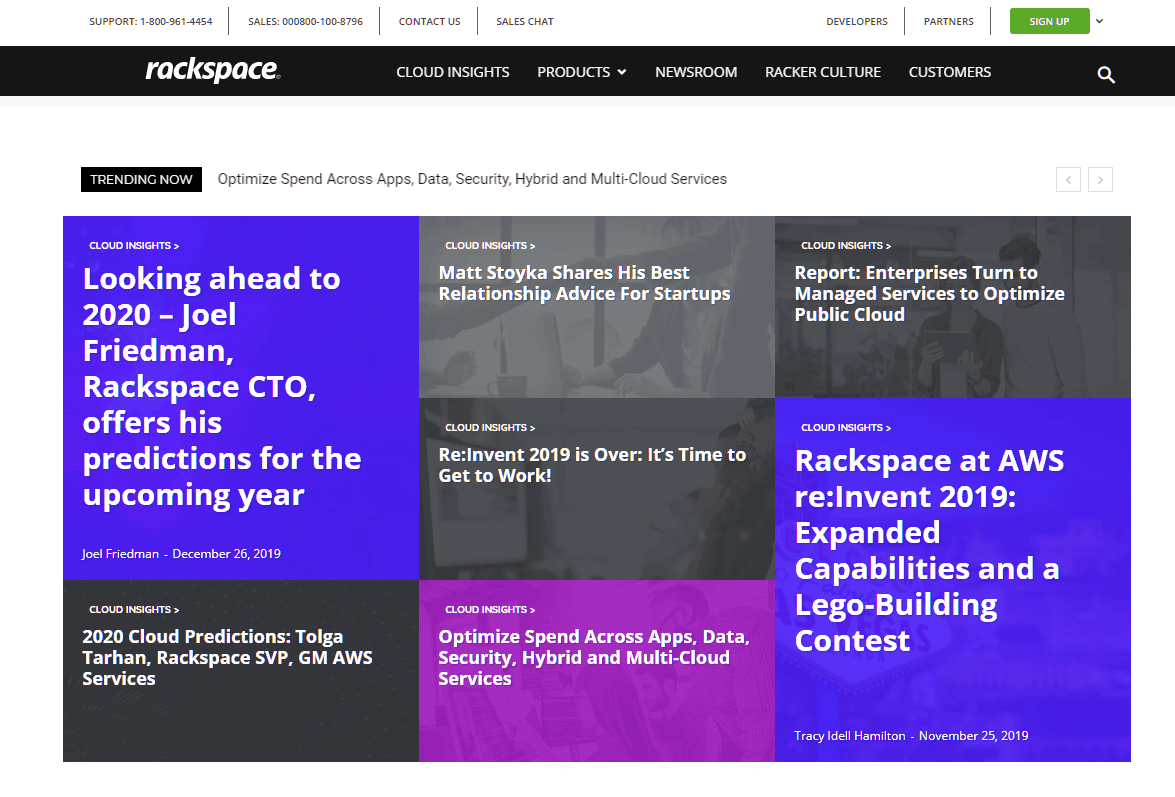
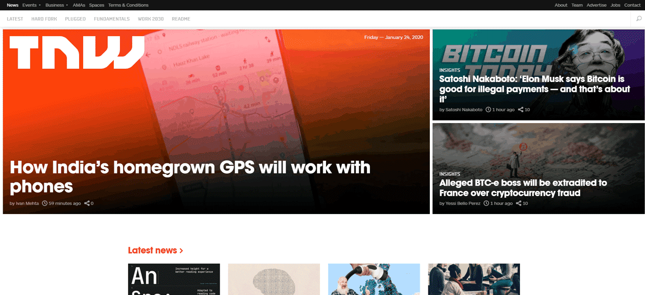
When visiting the popular blogs out there, you can see that most of them feature a few trending articles right at the top.
It helps to quickly drive the reader’s attention to those articles, thereby increasing the click-through-rate and reducing the bounce rate.
These are some examples:
Inspired by that, I was looking for a way to do that on one of my WordPress blogs. Unfortunately, I couldn’t find a plugin that does what I wanted.
So I decided to do it manually by writing some custom PHP, HTML, and CSS code. Since I was using the Astra Pro theme on that website, it made the process a bit easier.
Instead of adding the code to the theme files, I could add it from the WordPress dashboard itself using the Custom Layouts module inside the Astra theme.
I've also made a video, which can help you in understanding the steps better:
Here is how it looked finally on my travel and photography site:
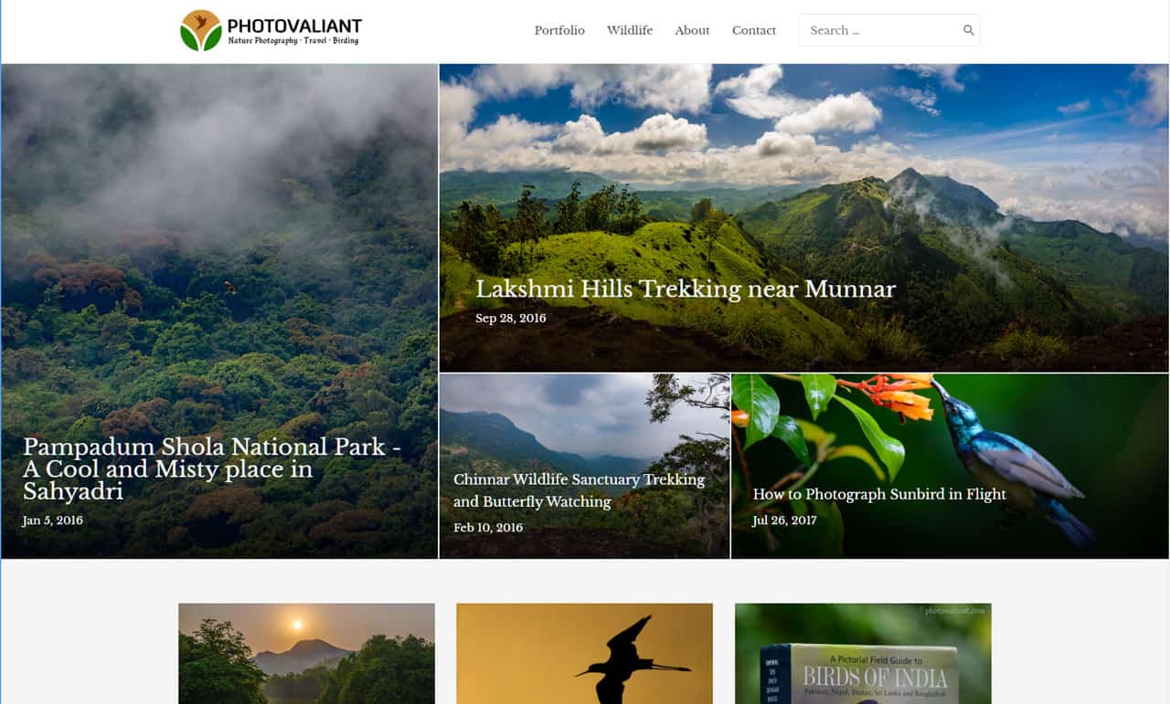
So this post also serves as a practical example of how to use the Custom Layouts feature.
Prerequisites
- Featured images set for posts
- Astra Pro / Code Snippets plugin
- Some HTML, CSS, and PHP knowledge
To make the layout look as I have shown above, you have to set featured images on the posts you want to highlight. Without that, the design may appear broken.
Another thing is, you need an Astra pro subscription to activate the Custom Layouts feature. After that, you should install the Pro addon plugin to access these extra features.
Alternatively, if you are using some other theme, you can use the Code Snippets plugin to add the same code from the WordPress dashboard without editing theme files.
What are Custom Layouts?
This premium module allows you to design custom sections and display them at various places on your site. Custom 404 page is an example.
The editor allows both visual and code editing. You can also use page builders like Elementor to design the layout. But here, we will be doing it by writing some code.
Steps to Create a Featured Posts Custom Layout
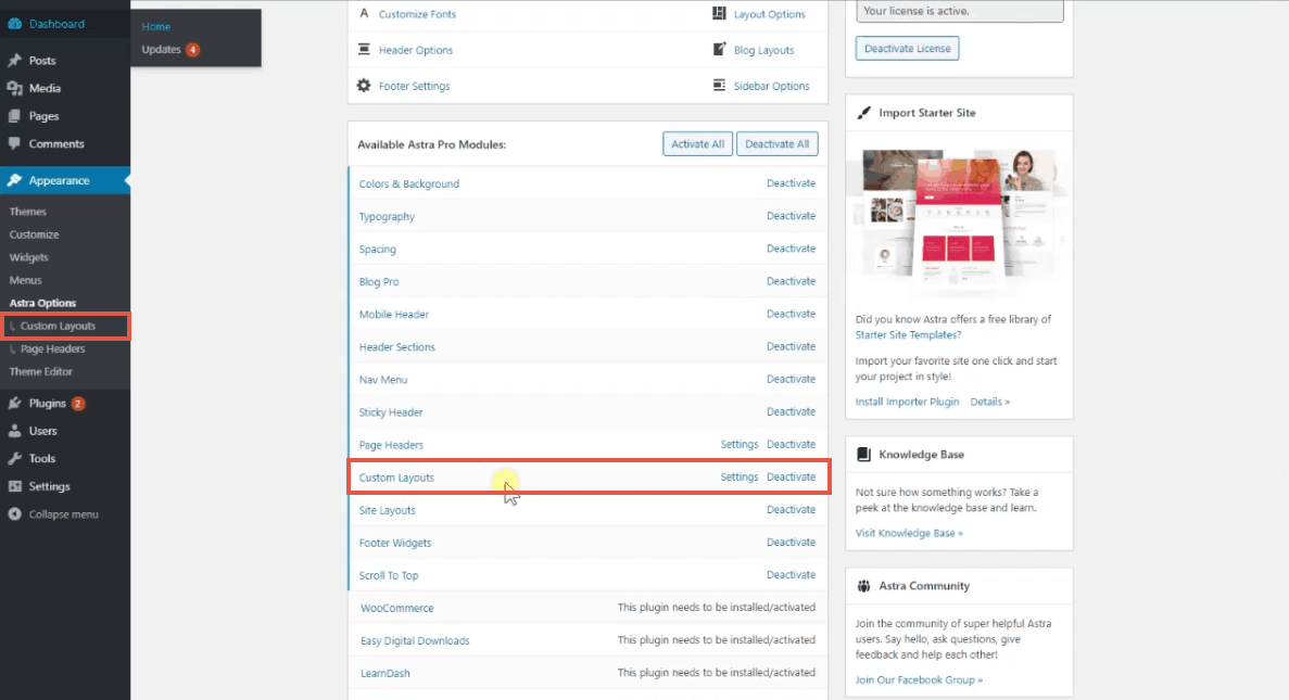
Activate the Custom Layout Module
The first step is to activate the module from the Astra theme’s Options page.
After activating, you will see a new menu item on the left side. Click on that to add a new layout.
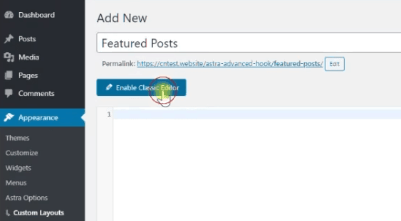
Add the PHP Code
After giving a title to the layout, switch the editor mode to write code. It can contain PHP and HTML input.
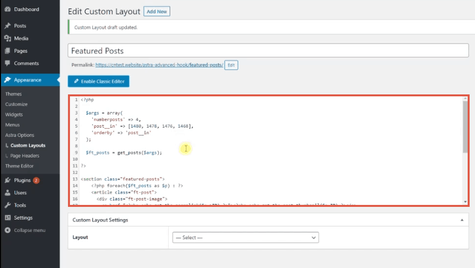
Here is the code I’ve used:
<?php

    $args = array(
        'numberposts' => 4,
        'post__in' => [1480, 1478, 1476, 1468],
        'orderby' => 'post__in'
    );

    $ft_posts = get_posts($args);

?>

<section class="featured-posts">
        <?php foreach($ft_posts as $p) : ?>
        <article class="ft-post">
            <div class="ft-post-image">
                <a href="<?php echo get_the_permalink($p->ID) ?>"><?php echo get_the_post_thumbnail($p->ID) ?></a>
            </div>
            <div class="ft-post-details">
                <header class="ft-post-title">
                    <h2>
                        <a href="<?php echo get_the_permalink($p->ID) ?>"><?php echo $p->post_title; ?></a>
                    </h2>
                </header>
                <div class="ft-post-meta">
                    <span class="ft-post-date"><?php echo get_the_date('', $p->ID); ?></span>
                </div>
            </div>
        </article>
        <?php endforeach; ?>
</section>
We used the function get_posts() - a built-in WordPress function - to retrieve four posts from the WordPress database. The function can receive one argument - a variable array specifying the conditions.
Other three WordPress functions we used above are:
get_the_permalink()- retrieves the permalink of a post based on the post IDget_the_post_thumbnail()- get the thumbnail image of a postget_the_date()- get the published date
Inside the post__in key, give the ID of posts you like to show as featured. Later, when you want to change the Posts, you have to change the ID keys.
Also, since we want the order of posts to be the same as given in the post__in array, set the orderby key to _post_in. Otherwise, by default, WordPress sorts the array of posts in the order of the published date.
And finally, we iterate through each post and output it inside HTML5 article tags.
Attach to an action hook
We want to show the HTML output somewhere. Right?
That’s what we do in the settings section.
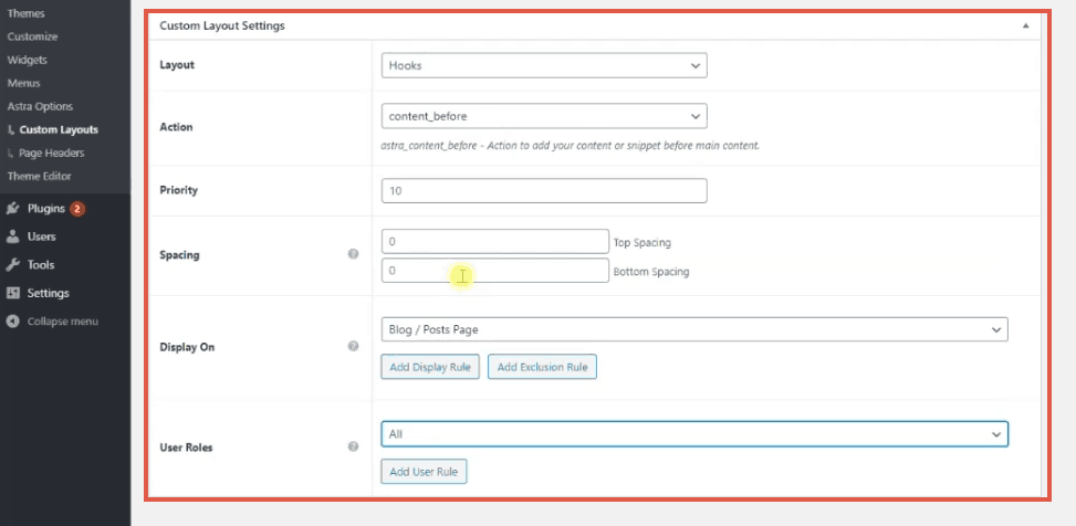
Since we are going to show the layout at the top of the blog page, we have to select the Hooks option.
Which hook?
The astra_content_before action hook.
It is a custom WordPress hook provided by Astra, which fires just before outputting the posts data, but after the header. That’s where we want to show our layout too.
The next step is to select the pages where you want to display the layout. Here, we will choose the Blog/Posts Page option. It will show the layout on the blog archive page while hiding it from individual posts and pages.
Finally, select user roles. We want to show it to all users. So select All. Instead, you can also choose the Logged In option first and change it to All after verifying that the layout is working as expected.
Then click publish to activate the layout.
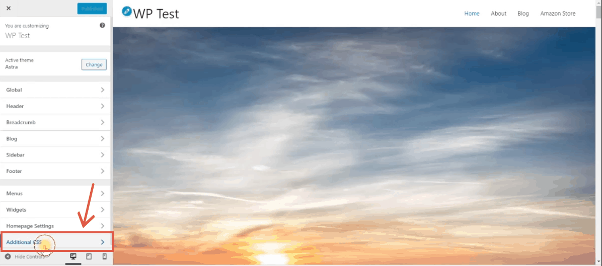
Add CSS rules
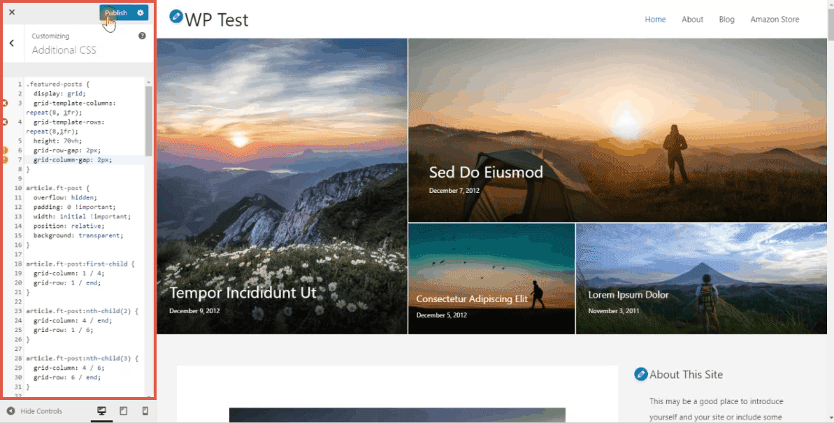
Now, the layout will appear unstyled if we visit the site. So, we have to add some CSS rules to make it beautiful. For that, we will use the WordPress Customizer, which shows a live preview on the right side as we write code on the left pane.
So, click on the Additional CSS option and add the code I’ve used to style the layout.
.featured-posts {
    display: grid;
    grid-template-columns: repeat(8, 1fr);
    grid-template-rows: repeat(8,1fr);
    height: 70vh;
    grid-column-gap: 2px;
    grid-row-gap: 2px;
}

article.ft-post {
    overflow: hidden;
    padding: 0 !important;
    width: initial !important;
    position: relative;
    background: transparent;
}

article.ft-post:first-child {
    grid-column: 1 / 4;
    grid-row: 1 / end;
}

article.ft-post:nth-child(2) {
    grid-column: 4 / end;
    grid-row: 1 / 6;
}

article.ft-post:nth-child(3) {
    grid-column: 4 / 6;
    grid-row: 6 / end;
}

article.ft-post:nth-child(4) {
    grid-column: 6 / end;
    grid-row: 6 / end;
}

.ft-post-image a {
    position: absolute;
    width: 100%;
    height: 100%;
    display: block;
}
.ft-post-details {
    position: absolute;
    bottom: 0;
    right: 0;
    left: 0;
    padding: 10% 5% 5% 5%;
    background: linear-gradient(to bottom, rgba(0,0,0,0), rgba(0,0,0,.8));
}
.ft-post-title a,
.ft-post-meta {
    color: #fff;
}
.ft-post-image {
    margin: 0 !important;
}
.ft-post-image img {
    display: block;
    width: 100%;
    height: 100%;
    object-fit: cover !important;
    transition: all .3s ease;
}
.ft-post-meta {
    margin: 10px 0;
    font-size: .8em;
}

article.ft-post:nth-child(3) .ft-post-title h2 a,
article.ft-post:nth-child(4) .ft-post-title h2 a{
    font-size: 18px;
}
.ft-post-title h2,
.ft-post-title h2 a {
    line-height: 1;
}

article.ft-post:hover .ft-post-image a img {
    transform: scale(1.1);
}

@media screen and (max-width: 1024px) {
    article.ft-post:first-child {
    grid-column: 1 / 5;
    grid-row: 1 / 5;
}

article.ft-post:nth-child(2) {
    grid-column: 5 / end;
    grid-row: 1 / 5;
}

article.ft-post:nth-child(3) {
    grid-column: 1 / 5;
    grid-row: 5 / end;
}

article.ft-post:nth-child(4) {
    grid-column: 5 / end;
    grid-row: 5 / end;
}
}

@media screen and (max-width: 600px) {
    article.ft-post:first-child {
    grid-column: 1 / end;
    grid-row: 1 / 3;
}

article.ft-post:nth-child(2) {
    grid-column: 1 / end;
    grid-row: 3 / 5;
}

article.ft-post:nth-child(3) {
    grid-column: 1 / end;
    grid-row: 5 / 7;
}

article.ft-post:nth-child(4) {
    grid-column: 1 / end;
    grid-row: 7 / end;
}
    .featured-posts {
        height: 90vh;
    }
    .ft-post-title h2 a {
        font-size: 15px;
    }
    .ft-post-meta {
        display: none;
    }
}
What we used here is CSS Grids - a modern way to arrange elements in a two-dimensional form. You can check out this guide on CSS Tricks to learn more about how to use grids.
First, we changed the display property of the parent section element to grid. Then we defined the number of columns and rows using the grid-template-columns and grid-template-rows properties, respectively.
Next, using the grid-rows and grid-columns properties, we set how much space each element should take up inside the grid.
In the final step, we have also added some media queries to make the grids responsive. So, our layout will have different arrangements for desktop, tablet, and mobile devices.
After verifying the appearance on all the device preview, click on the publish button to make the edits go live.
Wrapping up
While featuring posts may not be required for all blogs, it helps for specific niches like news, travel, and photography.
What we have seen above is just one way to do that. If you know a bit of PHP, HTML, and CSS, you can design it in any way you want.